The new logo is fine but so was its predecessor. I cannot understand the obsession of "big corporations" with non-essentials like logos and colours. What really turns me on is the product. And that is where Ubuntu really excites me!
And where Ubuntu has gained my loyalty and commitment ...... however they may choose to fiddle with logos and such like
Just to be different: I prefer the 2004 one!!
The 2004 logo looks like 3 unique people coming together as one, which is the very essence of the word. The 2010 logo looks like a monochrome variant, but loses the individuality aspect. The 2022 logo looks like a ball bearing, almost taking the humanity out of it. Not a fan. Sorry.
The rectangle is weird; otherwise fine. Does anyone know they did away with the 2004 multi colour friends? For me, that would have been a better starting point - apply the head within the circle, and arms linked...
The new logo is fine by me but that weird rectangular box should have been a square to keep the Logo uniform. In the animation i would have chosen to have the Ubuntu coming out of the box instead of how it currently is.
But with this all said it would have been bold to ad another friend to signify growth.
I would prefer square instead of rectangular box and the height of logo same as the height of square.
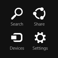
The New Ubuntu Logo is pretty much the same as the Windows 8 Share icon. https://uploads.disquscdn.c...
Meh (x3) - So long as its not a Windows flag, it's fine.
The logo is not really weird looking. It's fine.
The new logo loses a lot of the character and identity of the 2004 & 2010 logos and it looks like a ball bearing. The capitalization of the letter "U" is a big mistake, the b is bigger than "U"while the rectangle is even bigger. This revamp is a big mess.
It becomes Uchiha Madara
Ubuntu branding used to be the best in Linux, and surely distinctive and unique when comparesd to other IT brands. This new version is stupid. They trade their unique logo with a generic icon, already used in Windows 8 charms as a "share" symbol. They also messed up their unique wordmark: the capital U is a generic typeface, not as recognizable as the previous small caps u, that is showcasing their ubuntu unique and taylor made font.
I still prefer the old one. The circle of friend in new one isn't placed in the middle of rectangle, which makes me kind of annoyed.
i liked the old logo better but the new one is fine linux is still number one to me,i said good bye too microsoft 6 years ago and never had one regret .
I prefer the 2010 logo.
Rebranding the logo simply for the sake of rebranding is silly and causes me some concern. I mean, do they really believe this will make people think they're hip and new? To me, it shows a lack of commitment to the brand. If the branding had become notably outdated or Canonical had acquired a partner, then yes, change it; but the logo's simplicity along with the intended message was clear and stylish. {sigh} Too late now, I guess. On further reflection, the new symbol looks a lot like a refuse bin for recycling.
Gonna be weird sounding, But the original(s) were like standing in unity but looking up as though "In God We Trust", And the outer circle was an all inclusive universe. Now the circle is rejecting God for trust only in themselves, While being at one side of the universe by themselves and not all inclusive.
It looks fine 👍🏽. Although I like the 2010 logo best.
Both older ones are way better and more professional looking than the new one. Sorry, not sorry.
Ha! If you hadn't pointed it out I never would have noticed. Or cared.
As long as there is an LTS version every two years, I am a user and supporter. Branding is for superficial purpose. Just keep doing what they have been doing is all I care about. Solid platform.
As stated before, the original logo was very good, with multiple colors representing diversity. I am not fond of stylized homogeneous logos that look like icons on a computer... I don't like thos change.
this is stupid.
I liked the all lowercase. It had a very simplistic feel to it. And whats with the rectangle?
I always thought the chrome and Ubuntu logos were the 666 in a design. I hope none takes offense to me saying this. I really enjoy the OS, and look forward to Ubuntu touch on pinephone pro and maybe the lemonadeP. The 2014 was my favorite also. Thanks
if one is wise and has an understanding to count the number of the beast, which is also the number of a man, the number comes to 666.
We are in 2022 now. This new logo will go nowhere. BLM will sue b/c of not enough black. Women international league will sue b/c 3 persons is odd number, cannot represent gender equality. Gun association will sue b/c there is no guns. Flat earth conspirationists sue b/c it looks like a circle.
Just great comment.
I like the idea behind the icon(s), but not the execution because I never knew what the logo represented until I read this item today. A bit more detail in the icon may have made it clearer. I think it is sad when you have to explain what a logo represents because the logo does not do that for you.
The 2004 version seems to represent it as translated, People in a circle embracing and working together. New ones don't and the sparseness makes them just some balls and radiused bars. Looks like something thought up on a bar napkin just before last call.
The old logo was significantly more elegant, with the faces looking upward towards you. The new logo has them facing each other, freezing you out. The use of all lower case showed that within a team no one is more important than anyone else. Ah well.
How do I like the new logo? It's not up to me. None of my business. It is Ubuntu's logo and they can do with it as they please. I do think that once a logo is established, it should remain the same as the company becomes associated with the logo and changing it may cause confusion. But again, in the end, it is still none of my business what a company does with its logo.
All I care is for Ubuntu to work.
Can't see 666 like the Chrome logo. Not yet anyway. But if the dots end up a little bigger and offset to the interior of the circle then you will have 666.
"The new phone book is here! The new phone book is here!"
For some reason I am reminded of Microsoft, ( who have make heavy inroads into the Linux community over the last few years).
I like the new logo and the old one, love Ubuntu
Meh !
All are pretty simple, making simple logos simple isn't an issue the issue is when highly recognizable logos with obvious traits get slaughtered by simplification
Even I find the rectangle Weird
I think the 3 friends joining arms is a better representation of the philosophy. However, I agree that the square behind it would have looked better and could portray the world where we need to work better together.
The rectangle is a little weird but it is cool.
That space in the rectangle is to indicate that there's space for more people to join. Hahaha.
I actually don't mind it now that I'm past my initial reaction, though it makes me think a lot of the "Share" icon in Windows 8. Just as well they stopped using that icon for sharing in their UI, I suppose. https://uploads.disquscdn.c...
is like a piercing on the balls of a square man
I do like the new logo, but the rectangle background allows some people to separate in the corners, better would be a vertical ellips or keeping the circle that expresses more the community and togetherness.
I don't like UBUNTU, so I guess that answers your question. :)))))
Change for the sake of change. Can't figure out the rationale for making a bland logo to replace a perfectly fine one. I call it Corporate Wisdom, as unfathomable as the providence.
I prefer the 2004 logo. The different colors represented diversity within the circle of friends.